From Zomato to Google, New York – I did internships across the world. Here’s how I’ve built my career as a UX designer.
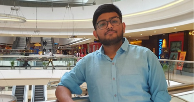
About the Author: Gaurav Baheti completed his B.Tech in Computer Science from Guru Govind Singh Indraprastha University, Delhi. He provides insightful details about his journey as a UI and UX designer and how he got internships at Zomato and Google, New York.
I’m a self-taught designer. I learned to design for the love of making things which I’ve been doing since childhood. From making tissue paper submarines to an igloo out of newspaper rolls (which I had to throw away the next day because there was no space to keep it. I could literally have lived in it!), I did it all. I couldn’t wait for every next weekend to try my hands on something new which I saw on TV or the internet.
As I entered college, I started working on creating designs and joined freelance sites like Warrior Forum, Fiverr etc. It was difficult to get started as a freelancer because people didn’t trust beginners easily. I remember my first freelance project was making banners for an online forum, free of cost. I kept making these banners for some time and mentioned them on my profile. Soon, a lot of requests started coming in and I began charging a minimal fee ($5) for them. From logo designs to web apps, I created a lot of designs for various projects.
In my second year of engineering, after some research, I came across Dunked.com, a free portfolio website. I put together a collection of my work that I had been doing as a freelancer and displayed it on that website. I started sharing it on different forums and social media channels while applying for specific startups that I admired, based on the problem they were solving or the design team they had.
It was the summer of 2014, and Zomato was recruiting. I applied through their website, and after a couple of interviews, I was selected for a tech internship (front end development) at Zomato. My first coding project at Zomato was to code responsive emails optimized for a majority of email clients (with a lot of testing) which were sent out when a user registers, adds photos/review, etc. It felt really good to know that these emails proved to make about 30% inactive users, active again. However, I got more excited about working with the design team so I asked if I could do more in that domain, and they gave me a shot. That worked out pretty well!
I was given the entire case, not just the bits and pieces of it, and within a stipulated time I had to redesign few of the major pages of the website and mobile apps. For the first time in my life, I was creating something which was going to be used by tens of millions of people around the world. With the help and guidance of design and product teams, I started working on the profile page, search results page, and then the restaurant page. I had to follow a strict design process to solve the problems with the previous design:
Research >>> Information Architecture >>> Wireframing >>> Prototype >>> Repeat
 This was a big learning for me! I was uncomfortable with following a process in the beginning and tried resisting it, but that’s not how it works. Good design is good for a reason. Always follow the process – I realized that this was an essential thing to do. Thank you, Zomato, for making me do it! Over the course of the summer, I not only worked on the responsive web design, but also did the Android and iOS design for the tour, login-signup flow, walkthroughs, feed, and profile. Also, I was lucky enough to get one major design project, the all new check-in feature. To sum up, it was a phenomenal experience!
I spent the winter of 2014 as the product designer intern at a startup called Zo Rooms and designed their website and iOS & Android apps. At this point, I had already interned at three companies and redesigned my web portfolio thrice. Every redesign still had some or the other defects, so I kept working on it until I felt that it was on par with portfolios of people who had previously interned at other big companies.
Your portfolio should answer everything that the position you’re applying for requires you to have.
Then came the phase of cold-emailing and applying through company websites. It’s a painful process because you have to deal with a ton of rejections. I applied for the summer UX design internship program at Google through their website and after waiting for 2 long months, I heard back from them. I was through the host matching phase and could interview for the position. I spent 3 days before the interview brushing up theoretical design fundamentals and polishing my portfolio. There were both subjective and objective interview rounds and they mostly revolved around my projects and about the process of completing them. Some technical questions about user research and typography were also asked. The interviewers mostly tried to understand why, how, and what about my projects/previous work, and whether I knew exactly what I was talking about. After two days, I finally received the email that I was hoping for – yes, I was selected!
I interned at Google, New York for 12 weeks. When I say, time flies, I really mean it. Life at Google is one thing, and life at Google, New York, is another. You get the best of life packed in one summer. Google took care of everything from Visa to relocation, but interns had to find the place to live on their own. I was one of the UX design interns on Google Classroom and Forms, and this team made my entire experience super awesome. My work consisted of creating prototypes and mocks after thorough user research and testing. I got to experience how a huge company operates and how the employees are managed in the best possible way. And, do I even need to say anything about the work culture at Google? They will throw all the perks at you, and you would soon stop counting them! The whole building belongs to Google and is designed like New York itself – from the A-B-C stairs like subway lines to the meeting rooms like the Apartment or Fulton Market. I generally had lunch at La Place, an 11th-floor cafe and spent nights on the roof sipping coffee and soaking up the view.


So how do you take the first step towards becoming a UI and UX designer? For me, that step has always been, curiosity! I started learning UX design by watching online tutorials, reading books, and making products that intrigued me. There are various resources available on the internet for beginners, many of which I personally used. I also saw a documentary that changed my thoughts about designing. It made me think differently about the world. And that’s when I really started to understand designs. For all the students aspiring to make a career in designing, I’ve just these three tips to share:
1. Learn to Sketch: You don’t have to master it but learning to draw lines and basic shapes enable you to visualize ideas in a way that words just can’t. You will be able to solve complex problems if you can visualize it well enough. And solving problems is the essence of being a designer!
2. Learn the tools of the trade: Product designers have a toolkit. Sketch (App) and HTML/CSS is a good point to start, but to get a good internship more skills are required. Learn to prototype in Principle or Marvel. Learn basics of animation in After Effects. Learn to make icons and illustrations in Illustrator. Learn the basics of JavaScript and dive into different frameworks.
3. Tools are temporary, problem-solving is not: This is the most important advice that I can give to anyone – learning the tools doesn’t make you a designer. Start with figuring out the right problem, researching your users, creating flows, etc. Learn to observe and communicate. There are a lot of things that are uncovered when you learn to observe like type leading and kerning, color palettes of graphics, the composition of photos, lights and shadows, video timelines, sculpture architectures, information hierarchy, and a lot more! Finally, keep practicing and creating – the more persistent you are, the better your designs.
My career was designed by internships. I understood the real essence of empathy and the way I saw life changed. The things you learn while working with different teams solving different problems for different people, stay with you forever.
Inspired by Gaurav’s journey and want to gain a similar exposure? Apply to these cool UI/UX design internships and get started!


